
*SNAP!
*SNAP!
A bold, flavour-charged identity for a modern chewing gum brand. Built around energy, freshness, and attitude, SNAP! brings a burst of personality to every chew — a brand made to pop with colour, confidence, and fun.
Scroll to the bottom to find out more!


SNAP!
Brief
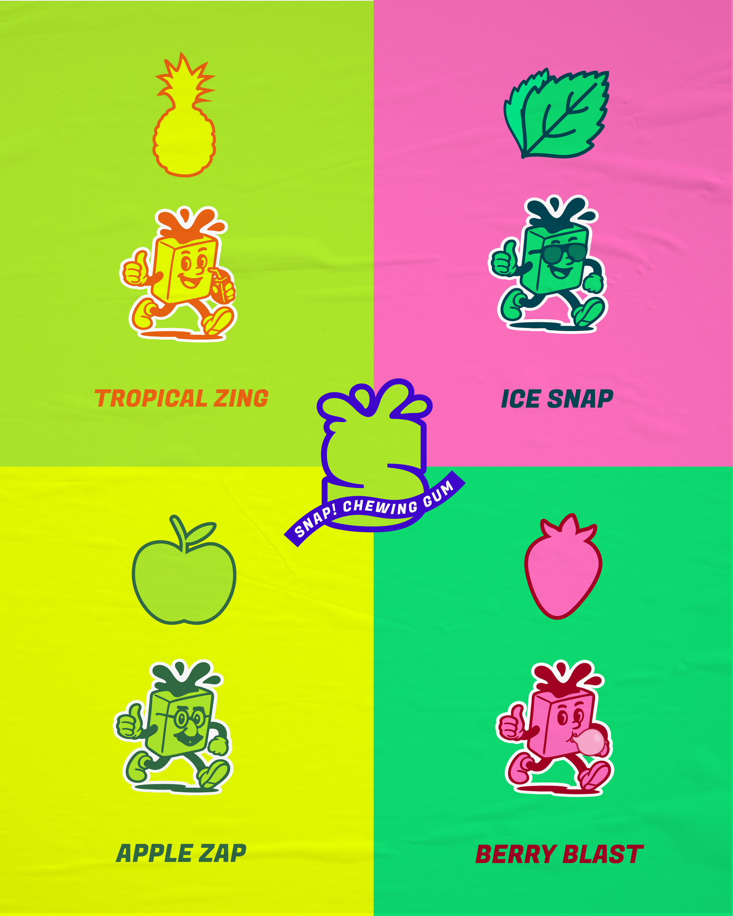
SNAP! is a fun-forward chewing gum brand for young adults who crave bold flavours, playful packaging, and eye-catching design. The brand needed an identity that was maximalist, expressive, and impossible to ignore — whether on the shelf or in your pocket. SNAP! celebrates big flavour, personality, and the excitement of collecting and swapping with friends.
Solution
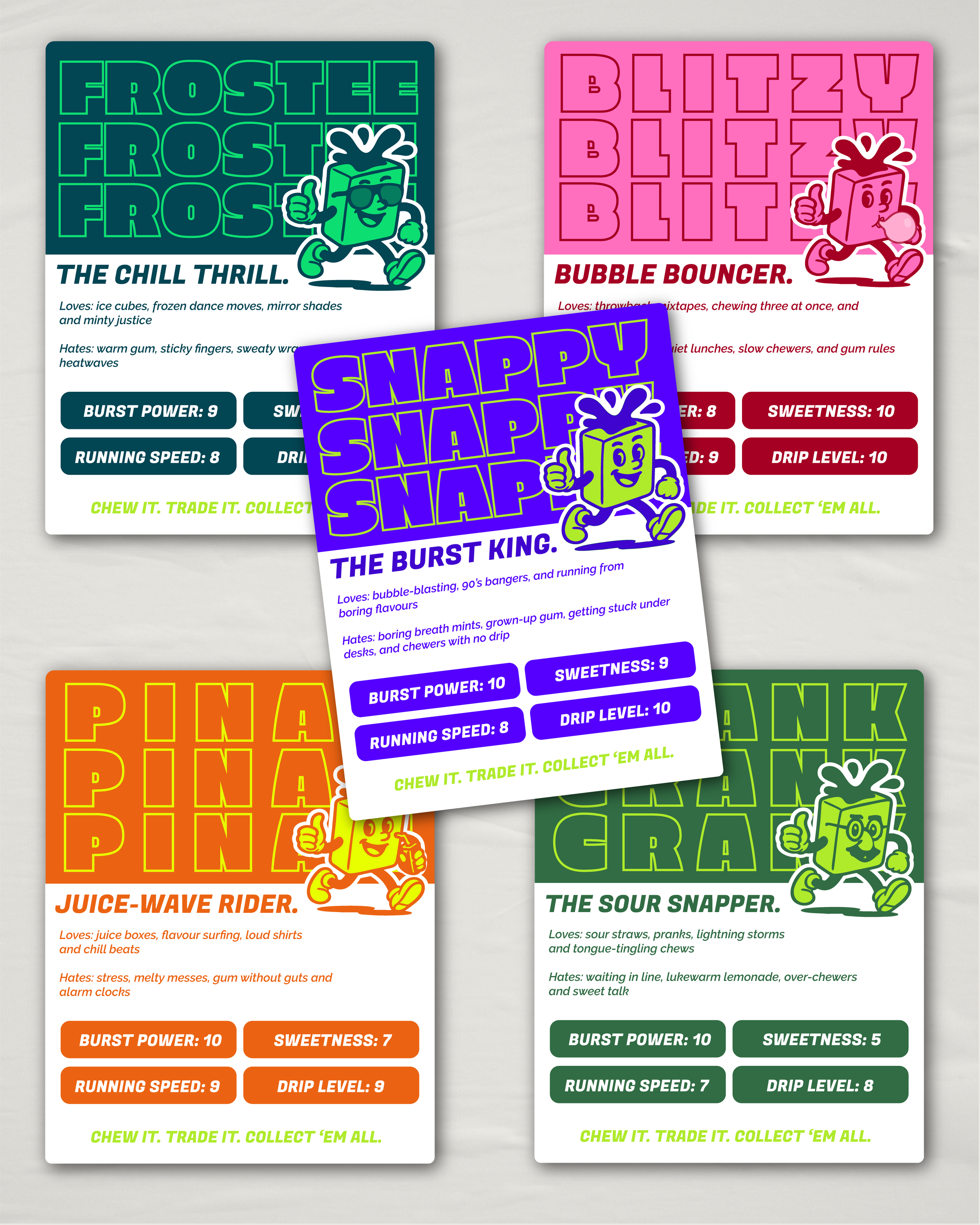
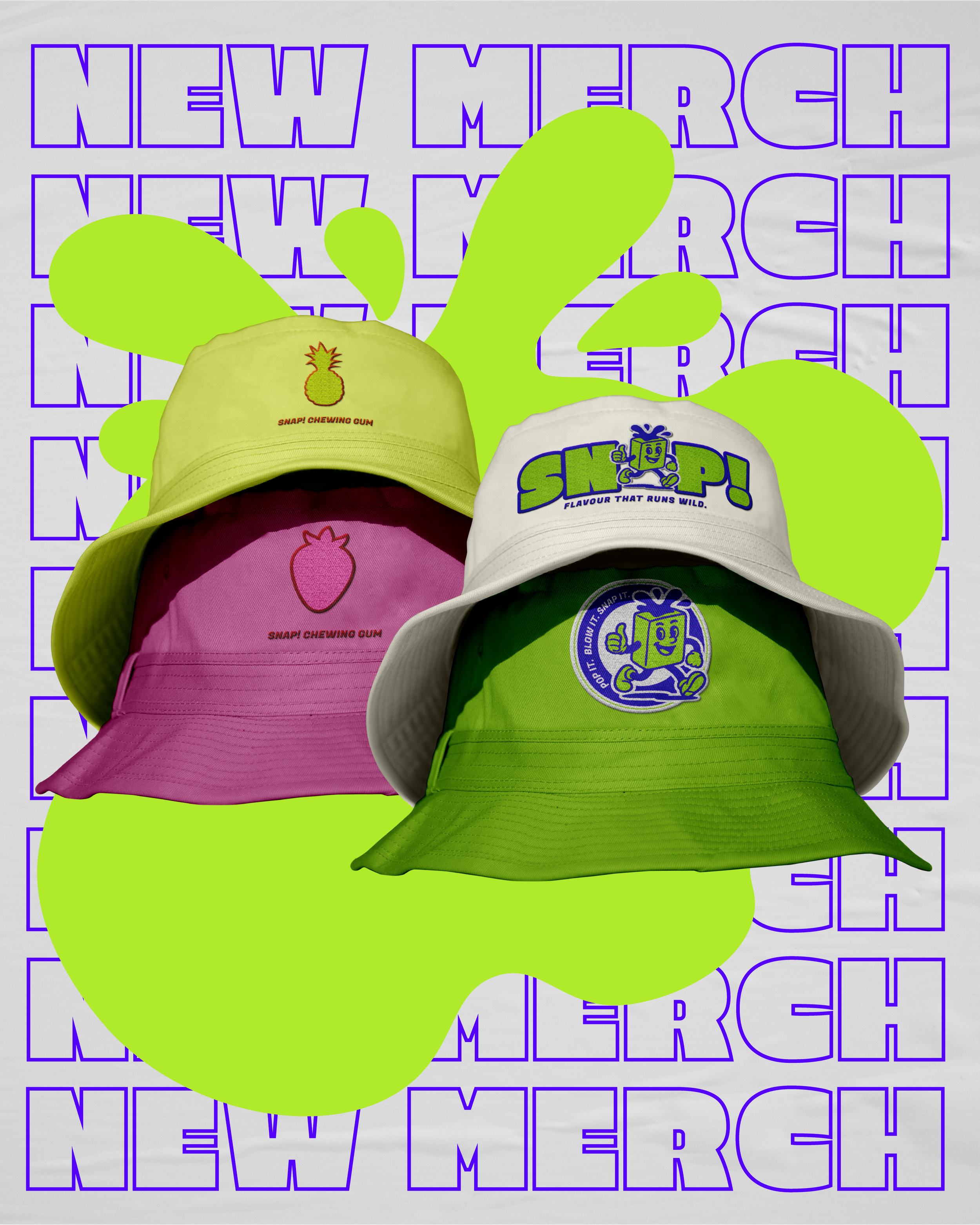
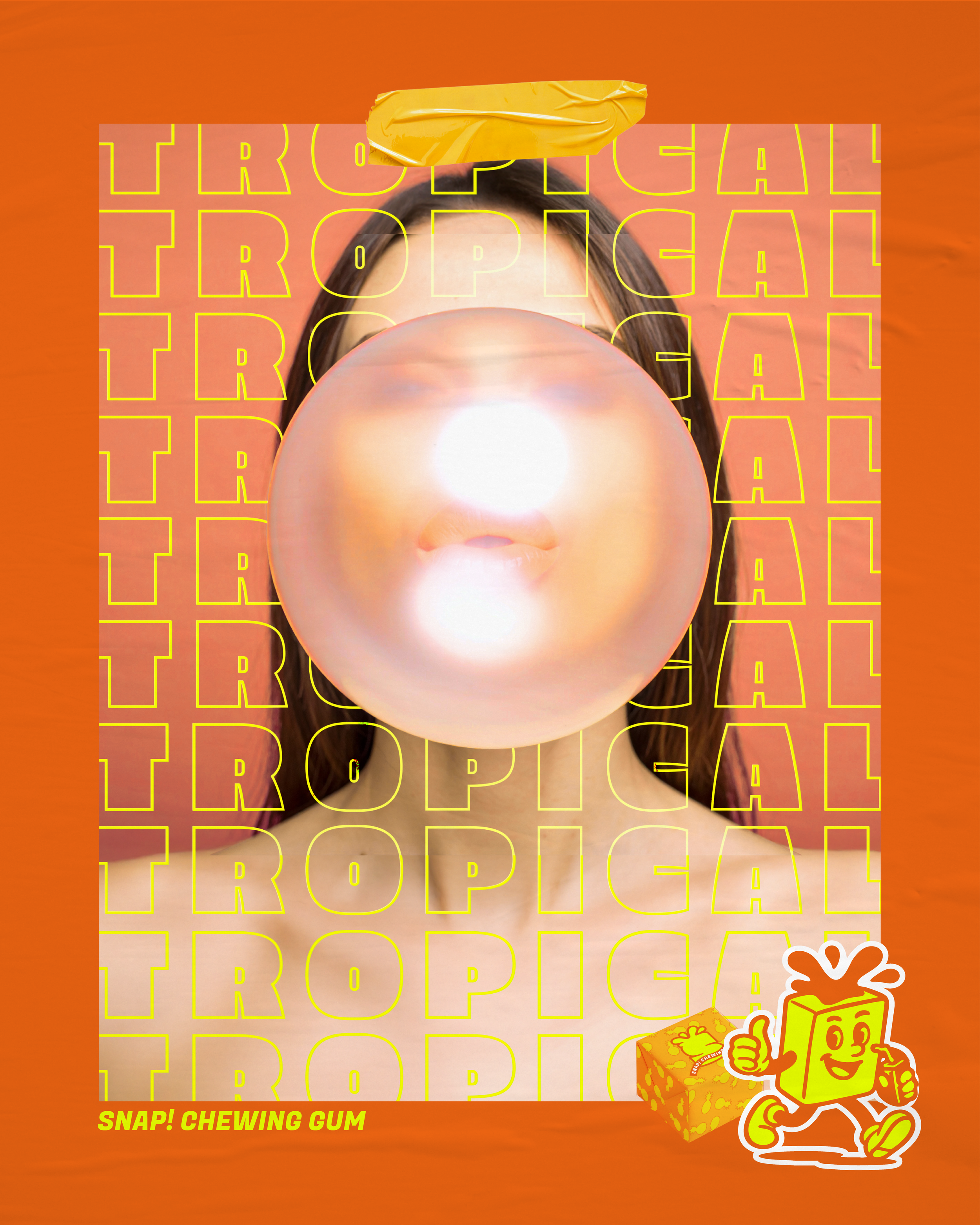
The visual identity blends bold, flavour-packed colours with energetic illustrations and playful typography to bring SNAP! to life. Each flavour has its own mascot and collectible card, complete with powers and quirks, while a rare ‘Snappy’ mascot adds a fun, exclusive element. Grainy textures, dynamic layouts, and bursting flavour graphics give a nod to the bold, playful aesthetic of 90s corner-shop treats, making the packaging feel nostalgic yet fresh. Every detail is designed to make SNAP! lively, collectible, and full of character.
Outcome
The final identity is expressive, bold, and packed with personality — a brand that feels both contemporary and nostalgic. SNAP! captures the fun-forward spirit of 90s gum culture while delivering modern, playful packaging and collectability. Every chew, every pack, and every card sparks excitement, making the brand feel like a pocket-sized throwback with a bold, flavour-packed twist.