
*Project Pup Mayhem
*Project Pup Mayhem
A rebellious, design-forward identity for a top-secret dog club.
Built for the pups who don’t sit pretty or fetch on command. Inspired by underground movements, gritty cult cinema, and the chaos of real dog life, this brand balances bold visuals with dry humour and a sense of rule-breaking charm.
Scroll to the bottom to find out more!


Project Pup Mayhem
Brief
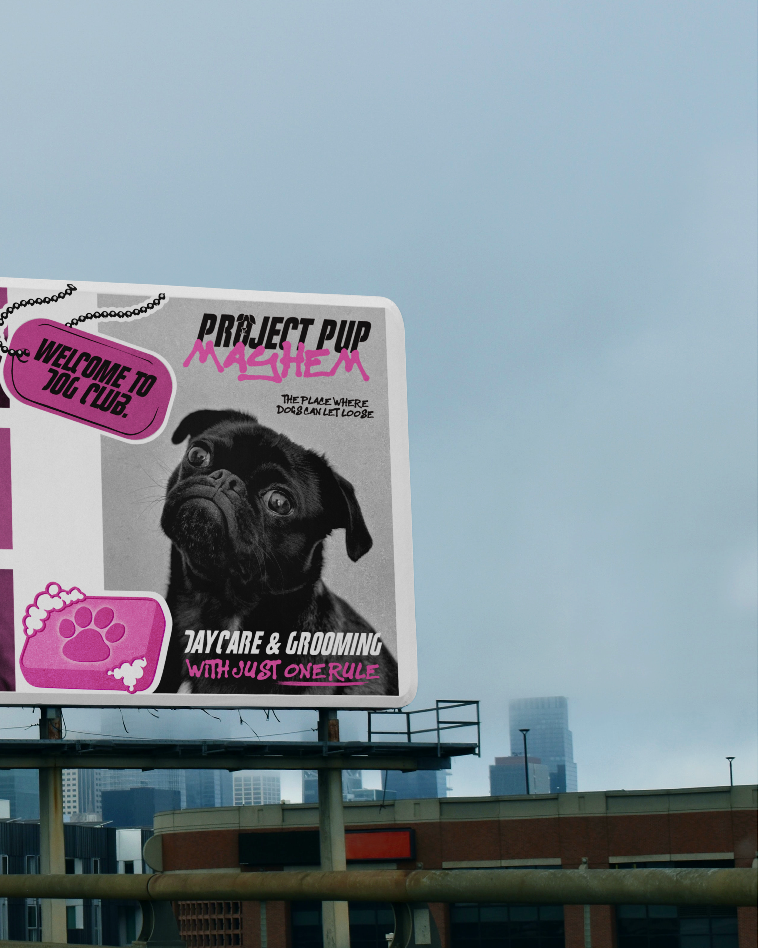
Born from a desire to flip the script on polished, Pinterest-perfect pet care, it’s a gritty lifestyle label for the disobedient dog and their equally discerning human. Offering daycare, grooming, and a curated selection of products, it needed a visual identity that rejected the twee in favour of something raw, cinematic, and cultish. Think: Fight Club meets dog club.
Solution
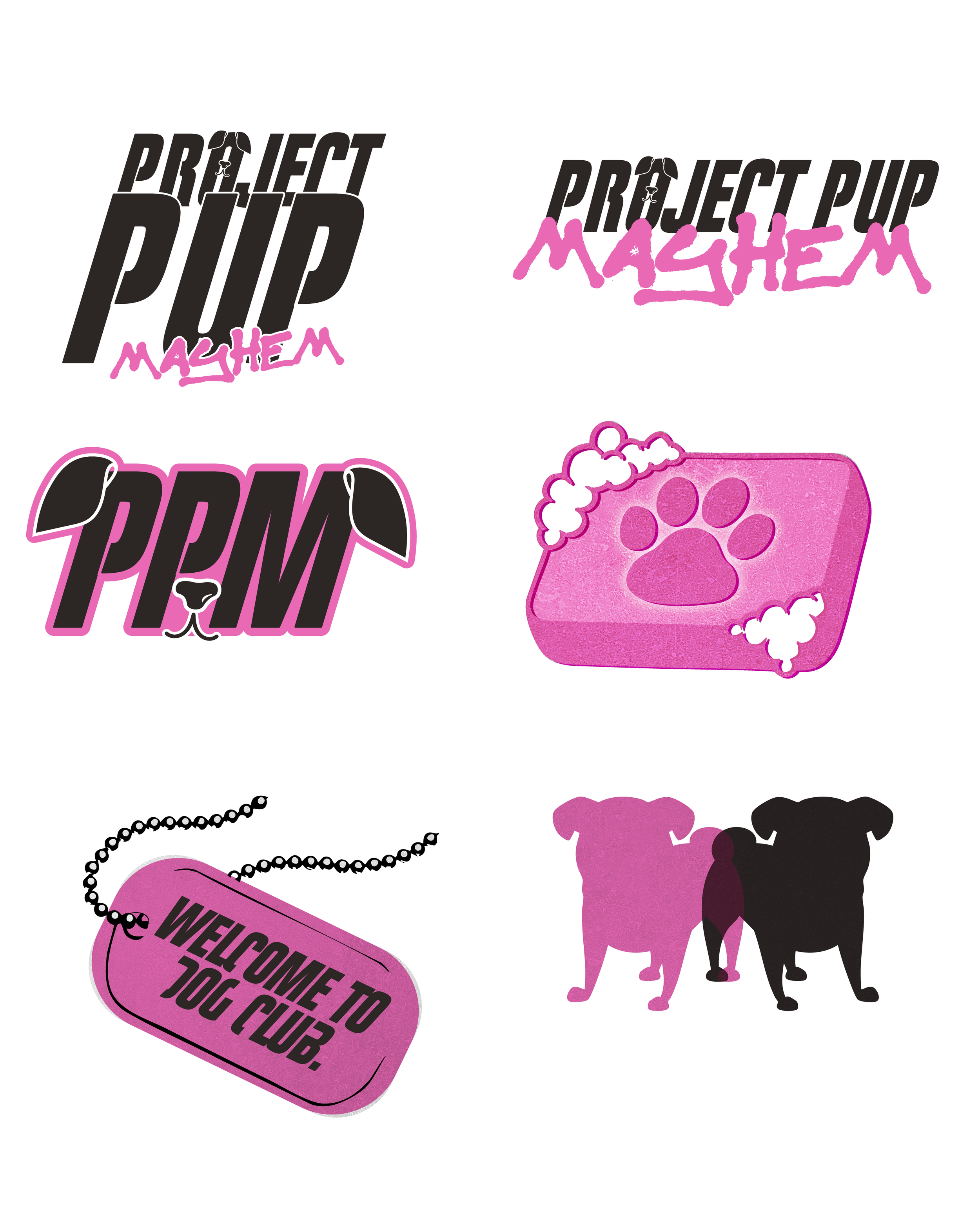
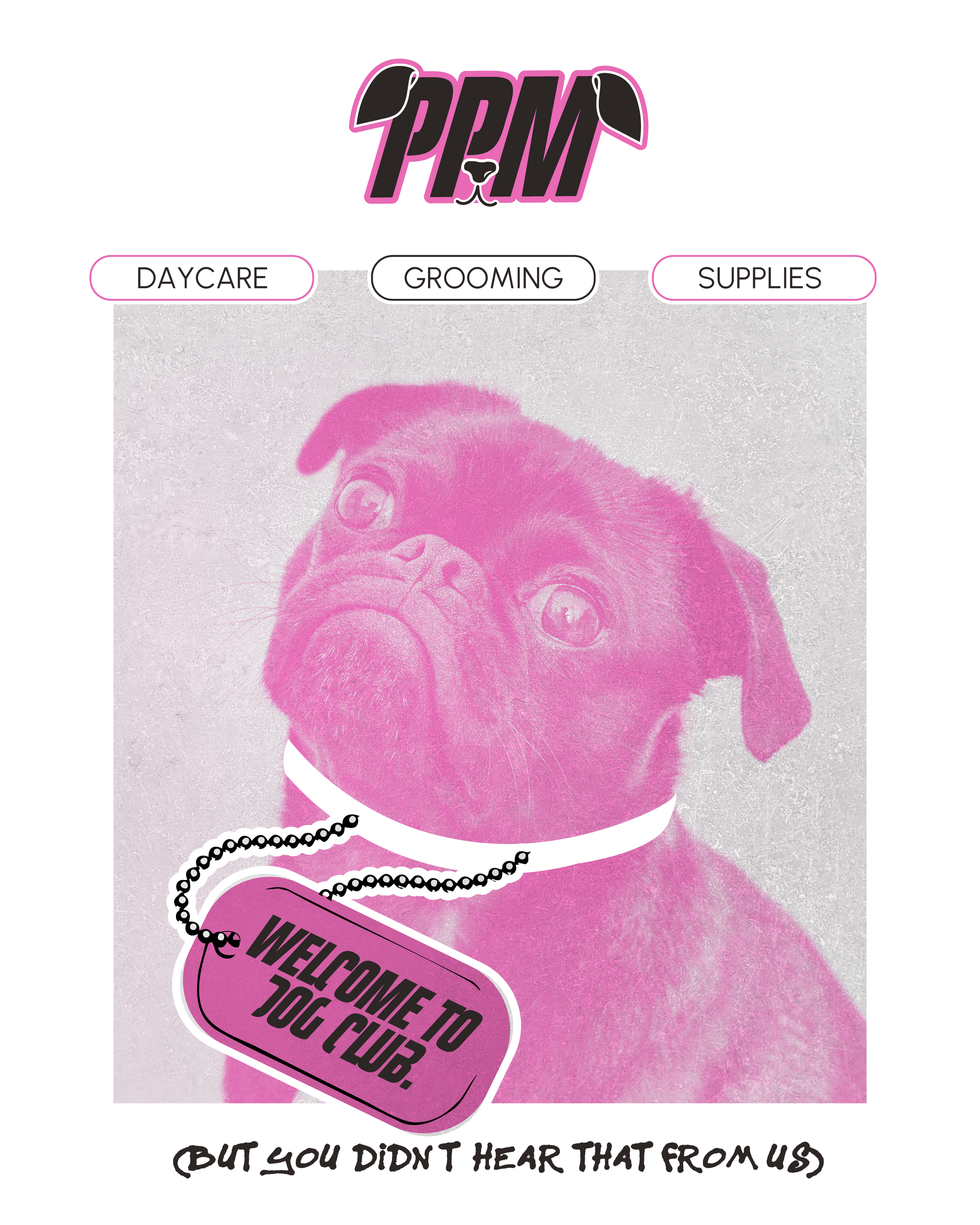
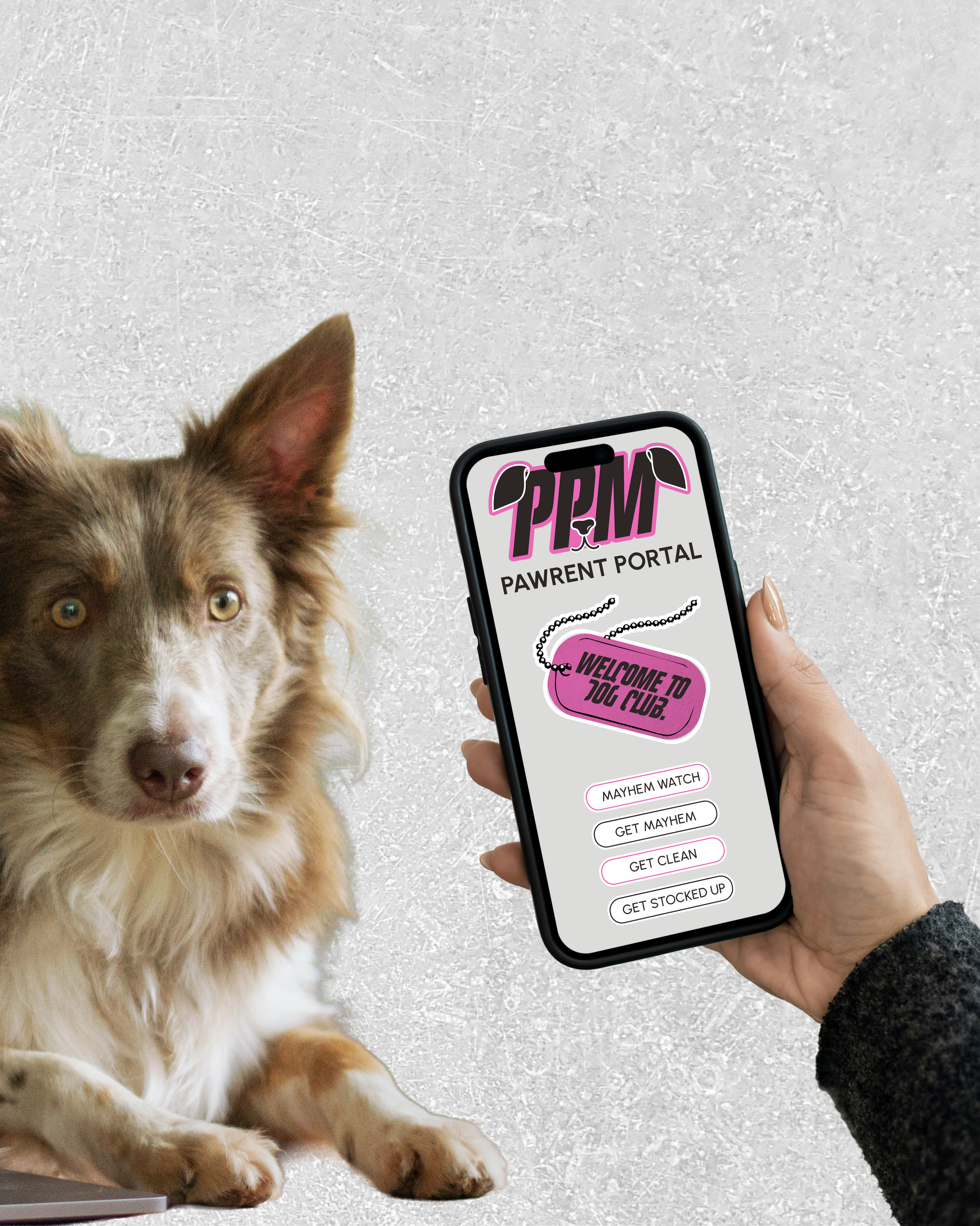
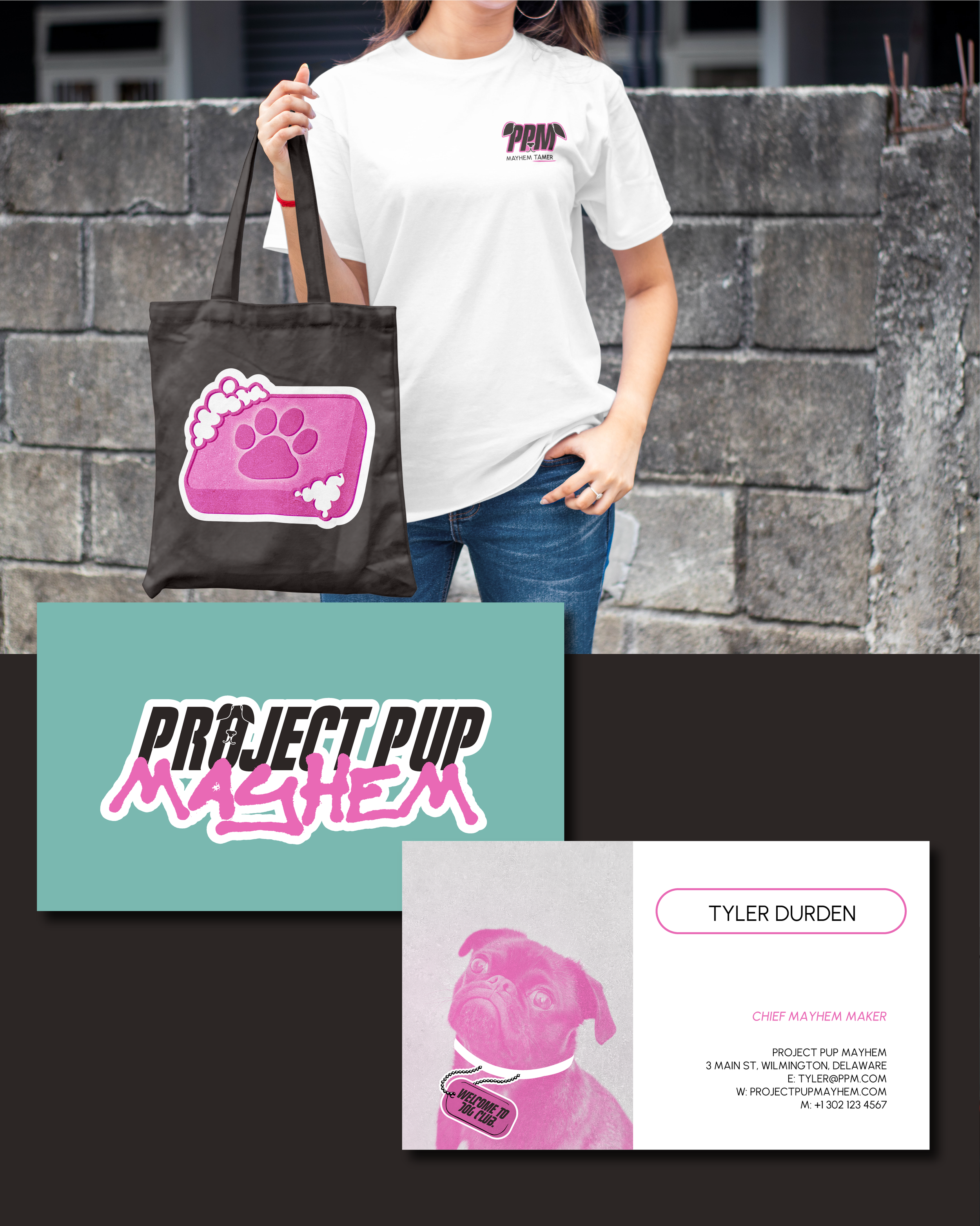
The identity leans on bold contrasts: hot pink, near-black, and icy blue-green - paired with blunt typography and dry, wit. Iconography is symbolic and story-driven: a soap bar nods to Fight Club, the twin pug logo captures duality and mischief, and the dog tag grounds the brand in reality. Every asset feels like merch from a secret club, not a pet business. Tone of voice is irreverent and exclusive. No baby talk, just dogs with attitude and owners who don’t follow commands. This isn’t just a brand - it’s a movement for misfits.
Outcome
The final identity is anti-fluff and full of edge. It invites dog people to see their pets not as accessories - but as agents of mayhem, deserving of a brand that understands them. Project Pup Mayhem doesn’t just cater to dogs. It celebrates the chaos they bring. A club for the unruly. A new breed of branding, built to cause a scene
This project is a creative work inspired by the style and themes of various films. All copyrights and trademarks related to these films remain the property of their respective owners. Any brands, names, or imagery used are fictional and not affiliated with or endorsed by the original copyright holders.