
*Mud + Stone
*Mud + Stone
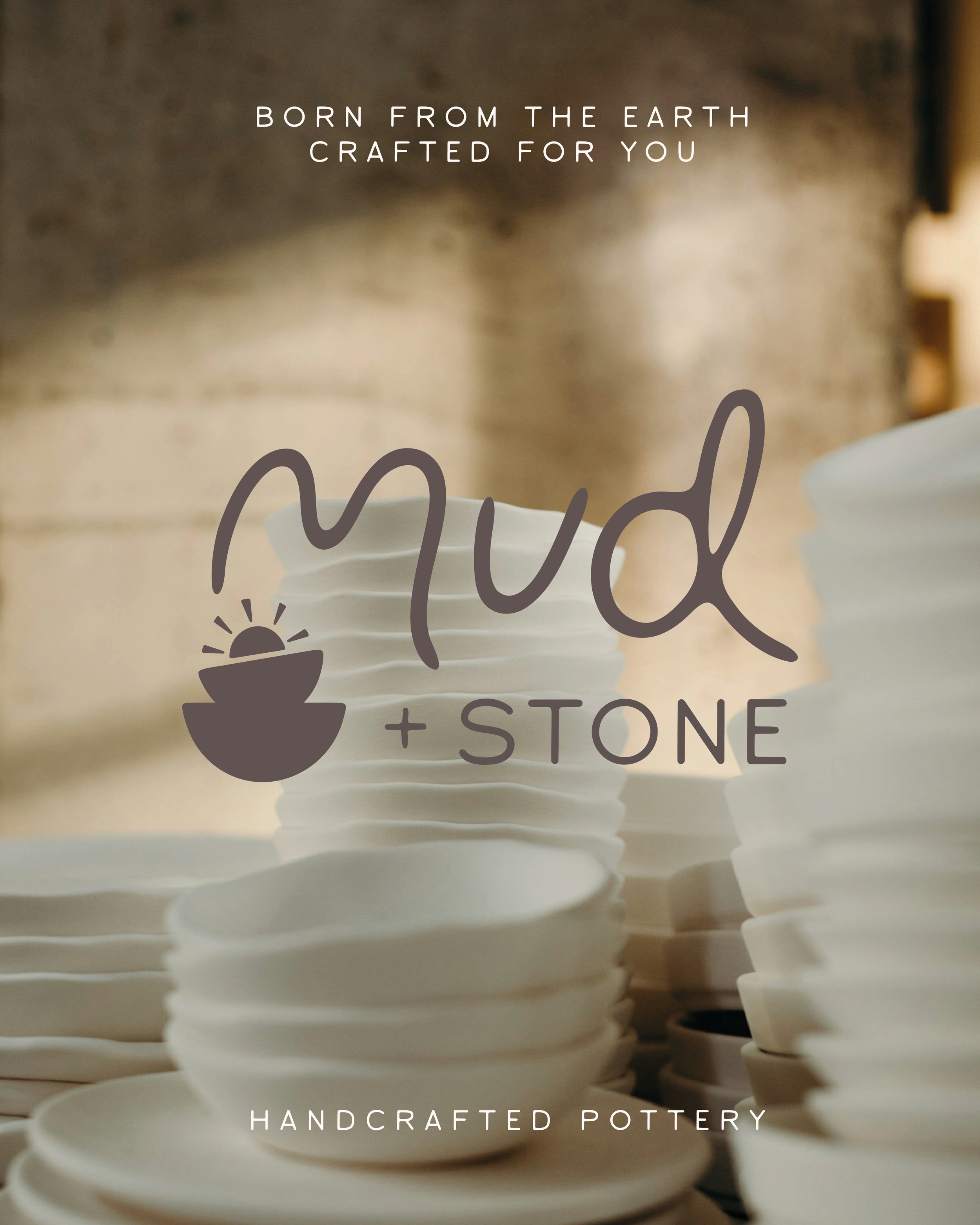
A grounded, organic identity for handcrafted homewares - inspired by the textures and movement of clay and stone. Soft, earthy, and beautifully minimal, the brand reflects the warmth these pieces bring into everyday spaces.
Scroll to the bottom to find out more!


Mud + Stone
Brief
Mud + Stone is a homewares shop specialising in handcrafted pottery, planted goods, and decor that brings warmth and texture to everyday living. They needed a brand that captured their organic, rustic roots while maintaining a clean, minimal aesthetic - something that felt grounded and artisanal, yet modern and refined.
Solution
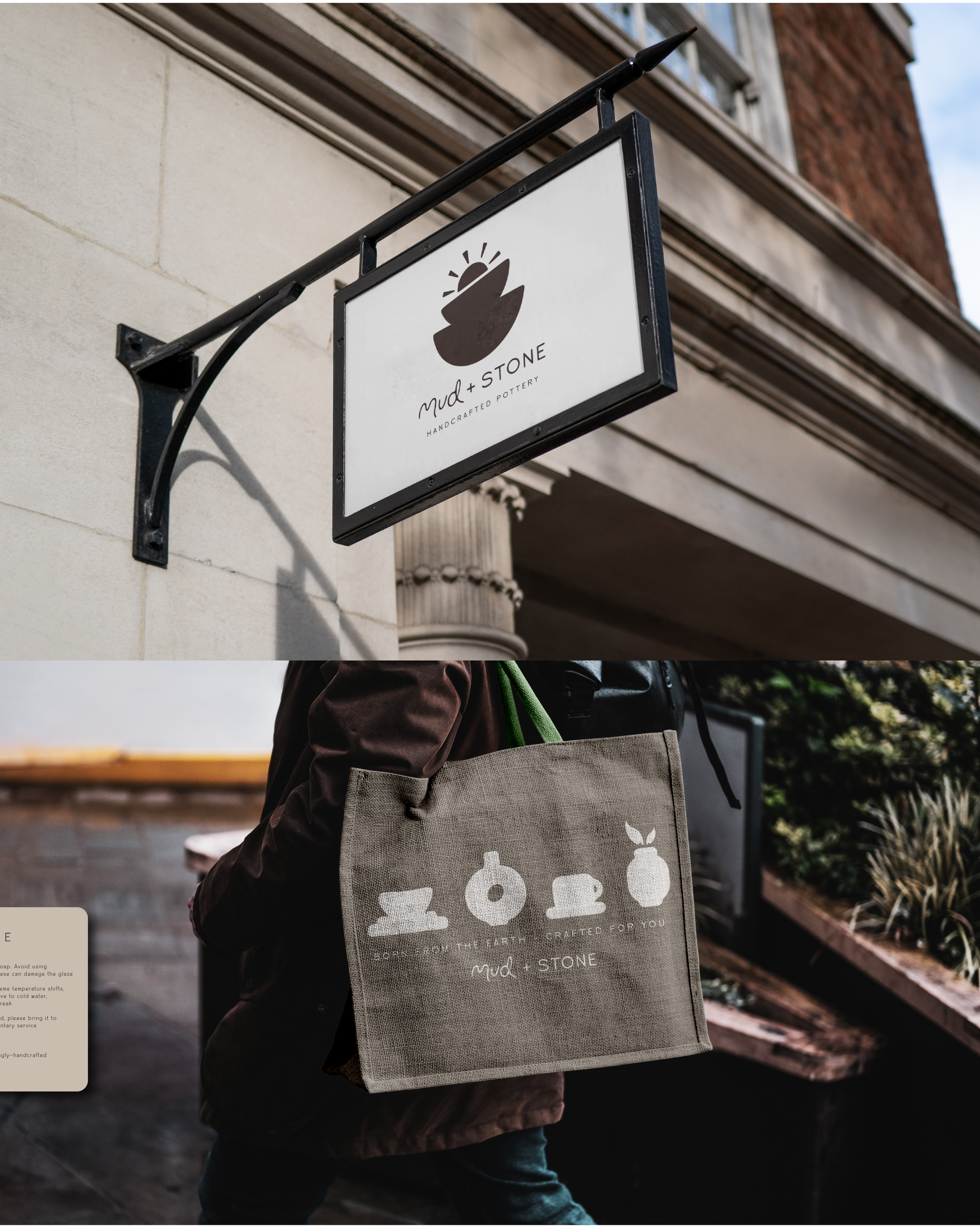
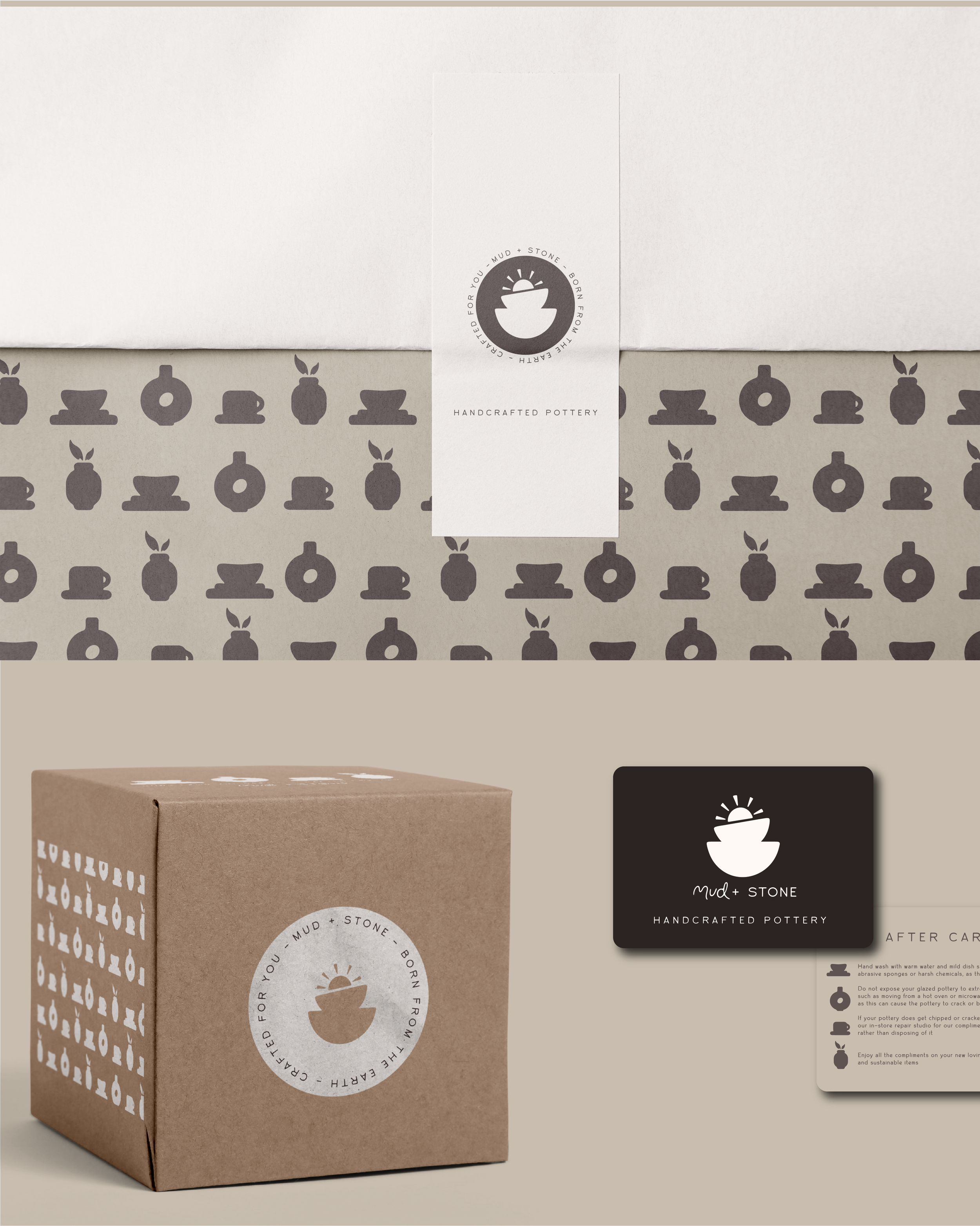
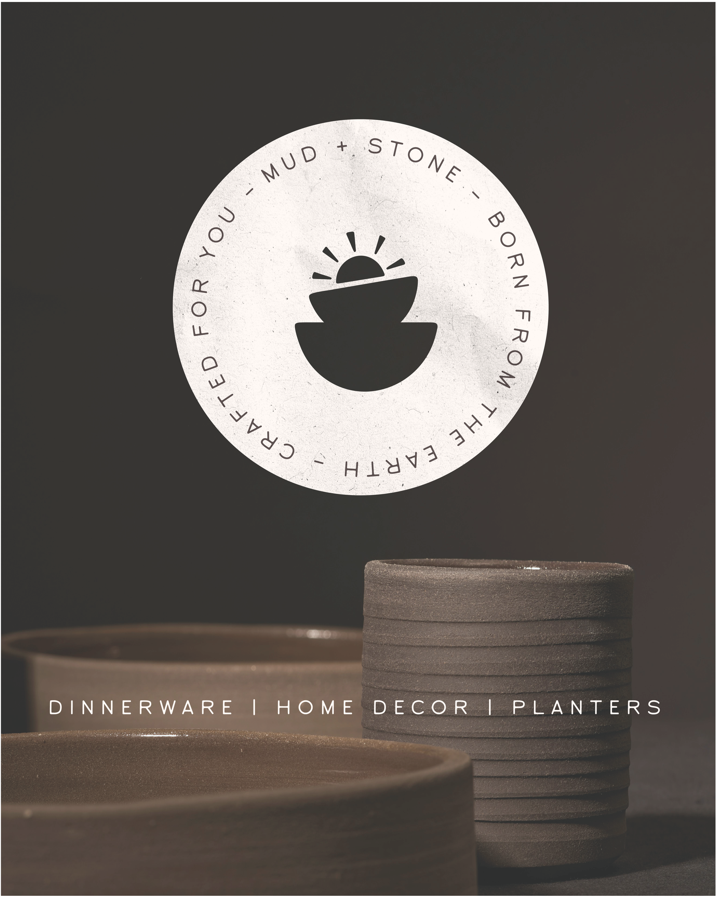
The identity balances movement and structure through a custom typographic system: a fluid, soft typeface evokes the form and feel of wet clay, paired with a more solid, stone-like font for contrast. A palette of muted earth tones and soft neutrals brings a sense of calm and warmth, while the logo - a rising sun emerging from a stack of clay pots - symbolises the quiet joy and natural beauty these pieces bring into the home. Custom product icons add a handcrafted touch and help showcase the variety of offerings in a cohesive, visual way.
Outcome
The final brand identity is warm, grounded, and quietly elegant. A refined visual system that reflects the care and craftsmanship behind every piece. It brings Mud + Stone to life in a way that feels both artisanal and contemporary, just like the homes it’s made for.