
*Kindrove
*Kindrove
A nurturing, character-driven identity for a childcare brand focused on emotional growth. Kindrove brings playfulness and purpose together - building a world where empathy, creativity, and resilience come to life.
Scroll to the bottom to find out more!


Kindrove
Brief
Kindrove is an early childhood brand rooted in emotional learning - where children grow through kindness, play, and imagination. The brand needed a visual and verbal identity that would feel both safe and spirited: a space for little minds and big feelings, guided by care, connection, and creativity.
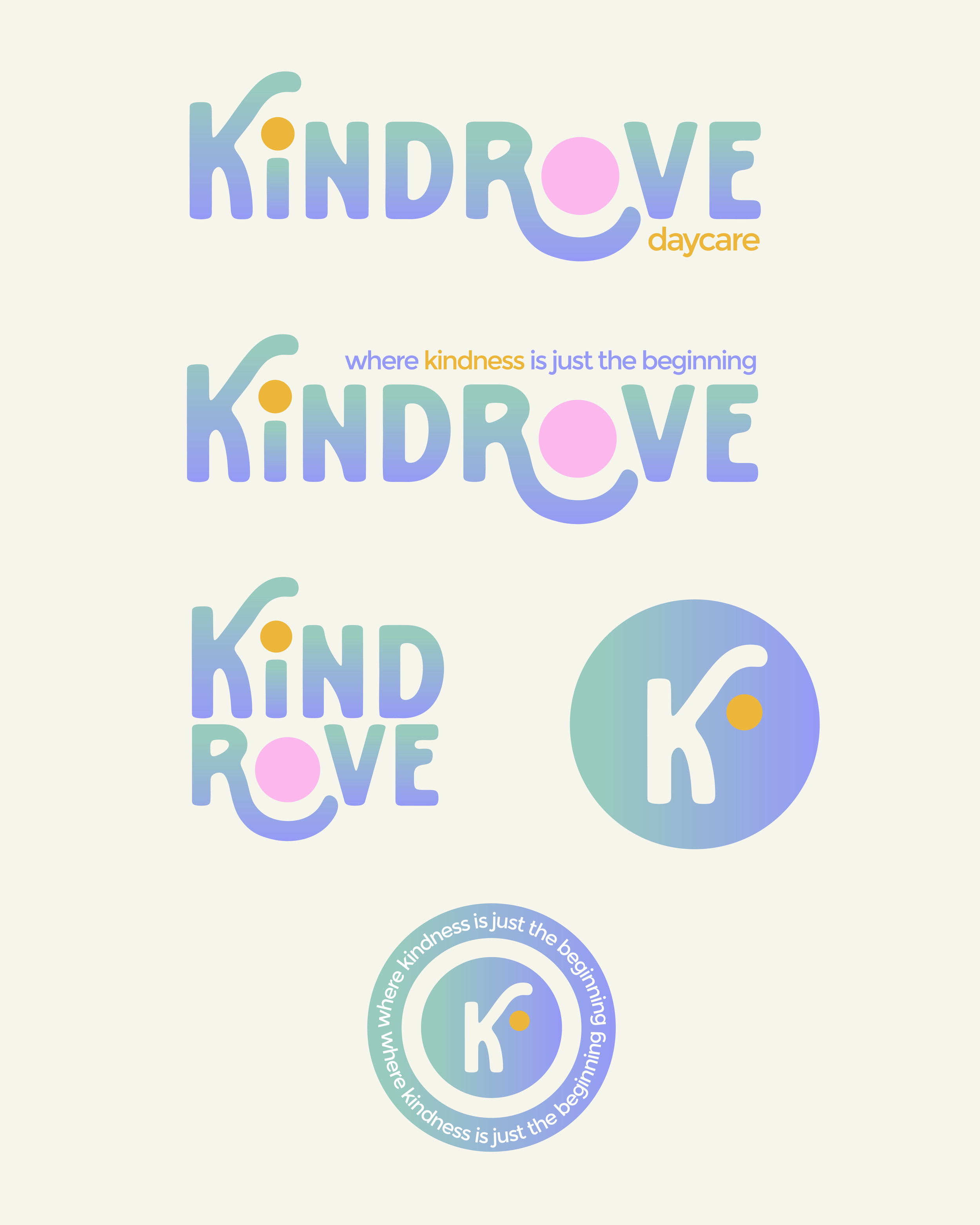
Solution
The identity centres around gentle boldness - soft shapes and rounded typography convey protection and warmth, while character illustrations bring key traits like empathy and confidence to life. The logo subtly shelters its letterforms, with curved arms of the “k” and “r” cradling the “i” and “o” to symbolise emotional support. A palette of playful but muted tones reflects calm joy, while whimsical shapes and character mascots (like Cora the heart and Blinky the star) help personify the brand’s emotional values. Taglines and tone are gentle but empowering and designed to speak to both children and the caregivers who nurture them.
Outcome
The final identity is thoughtful, expressive, and full of heart. By blending emotional storytelling with intentional design, Kindrove becomes more than a daycare: it’s a place where little ones learn how to be kind, confident, and creative.