*Coucou!
*Coucou!
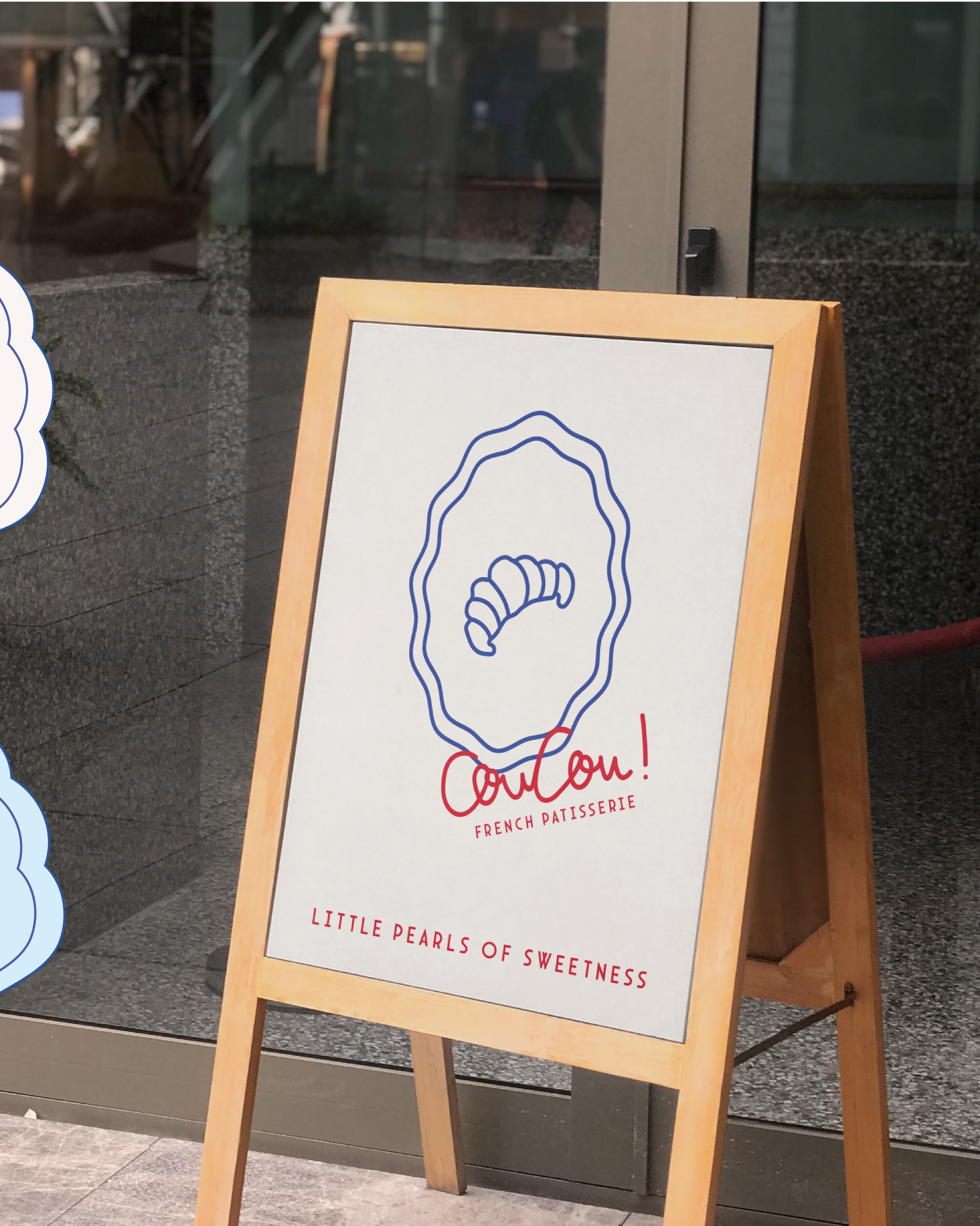
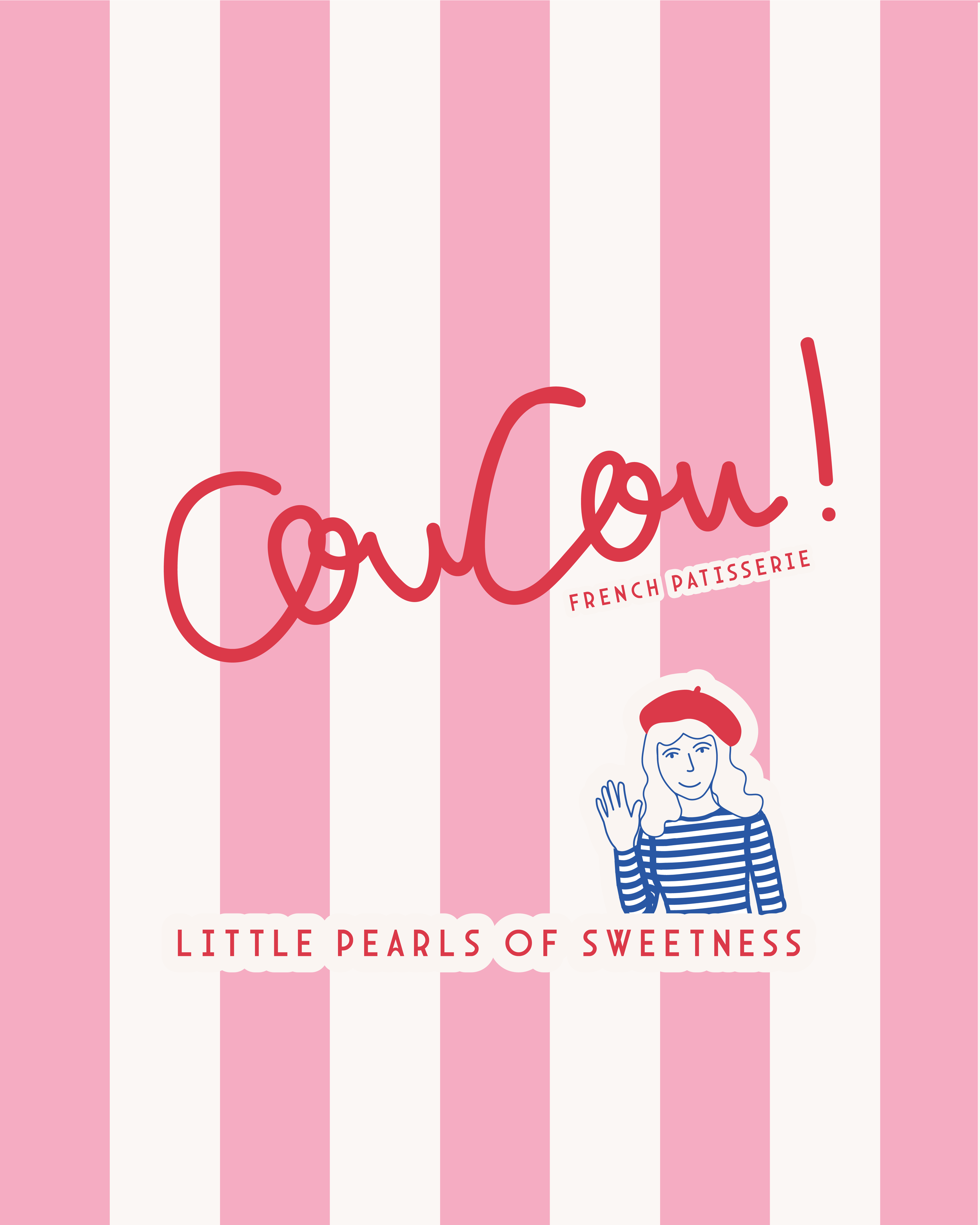
Inspired by “little pearls of sweetness,” this identity blends minimalist illustrations — from a chic French girl in a beret to buttery croissants and colourful macarons — with a whimsical palette of pinks, blues, and reds. A sweet, modern twist on classic patisserie style.
Scroll to the bottom to find out more!


Coucou!
Brief
Coucou! is a patisserie that serves fresh French pastries. Their mission is to create treats that feel warm and sweet. From flaky croissants to colourful macarons, everything is made to bring a smile, perfect for a coffee break or gift. Keywords: artisan, sweet, french, playful.
Solution
The Coucou! visual identity captures the joy and playfulness of a modern French patisserie — balancing chic minimalism with a wink of whimsy. A hand-drawn illustration style brings life to a striped, beret-wearing French girl nestled in an oyster shell (a nod to the tagline “little pearls of sweetness”) alongside charming pastry sketches. The colour palette of soft pinks, blues, and cherry red adds a fresh Parisian feel — nostalgic yet delightfully new. The tone of voice is warm, cheeky, and oh-so-French, inviting everyone to savour life’s small, sweet moments.
Outcome
The final identity feels sweet, spirited, and unmistakably French — a brand that’s as delightful as the pastries it serves. It’s playful but polished, handmade yet refined, designed to make people smile at first glance (and crave a croissant soon after). Coucou! brings together illustration, storytelling, and charm to create a patisserie brand that feels like a little love note from Paris.
